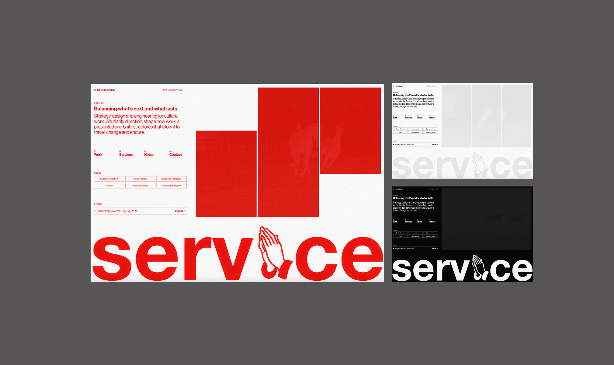
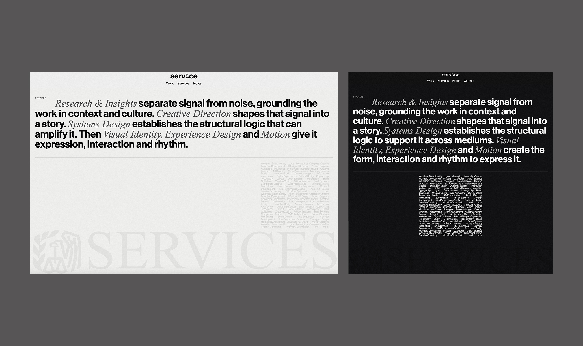
Balancing bold expression and disciplined
restraint, allowing clarity to do the work.
Service Studio needed a brand and digital presence that could be unmistakable without becoming noisy. The visual language leans intentionally bold—heavy use of red, assertive typography and irreverent logo treatments—while the underlying system is disciplined and highly controlled.
The work balances expression with reduction. Messaging and structure were pared back to their essentials, allowing the identity to operate loudly without confusion. By limiting content, clarifying hierarchy and removing unnecessary variation, the brand gains memorability through contrast rather than excess. The result is a system that is direct, legible and confident enough to hold boldness without losing focus.
Service Studio
Visual Identity System
Brand Strategy
Messaging & Narrative Framing
Experience design
Full-stack Webflow development
Creative direction
Identity & Messaging
Digital Experience Design & Build

